About the project
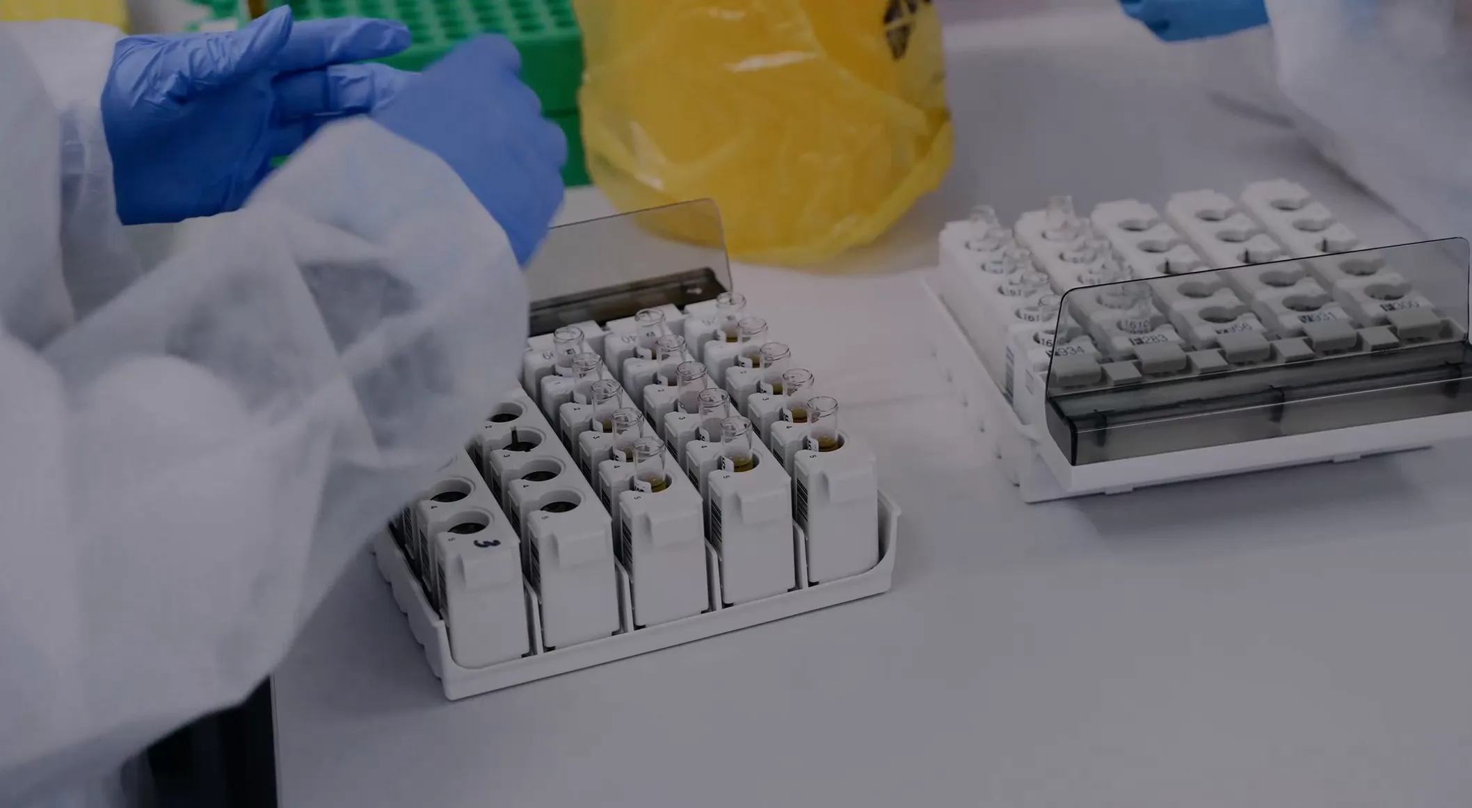
Abbexa supplies life-sciences research products, including antibodies, ELISA kits, proteins, and assay tools. Its extensive catalogue made product discovery central to the website experience.
The challenge was helping researchers understand, trust, and navigate a complex catalogue.
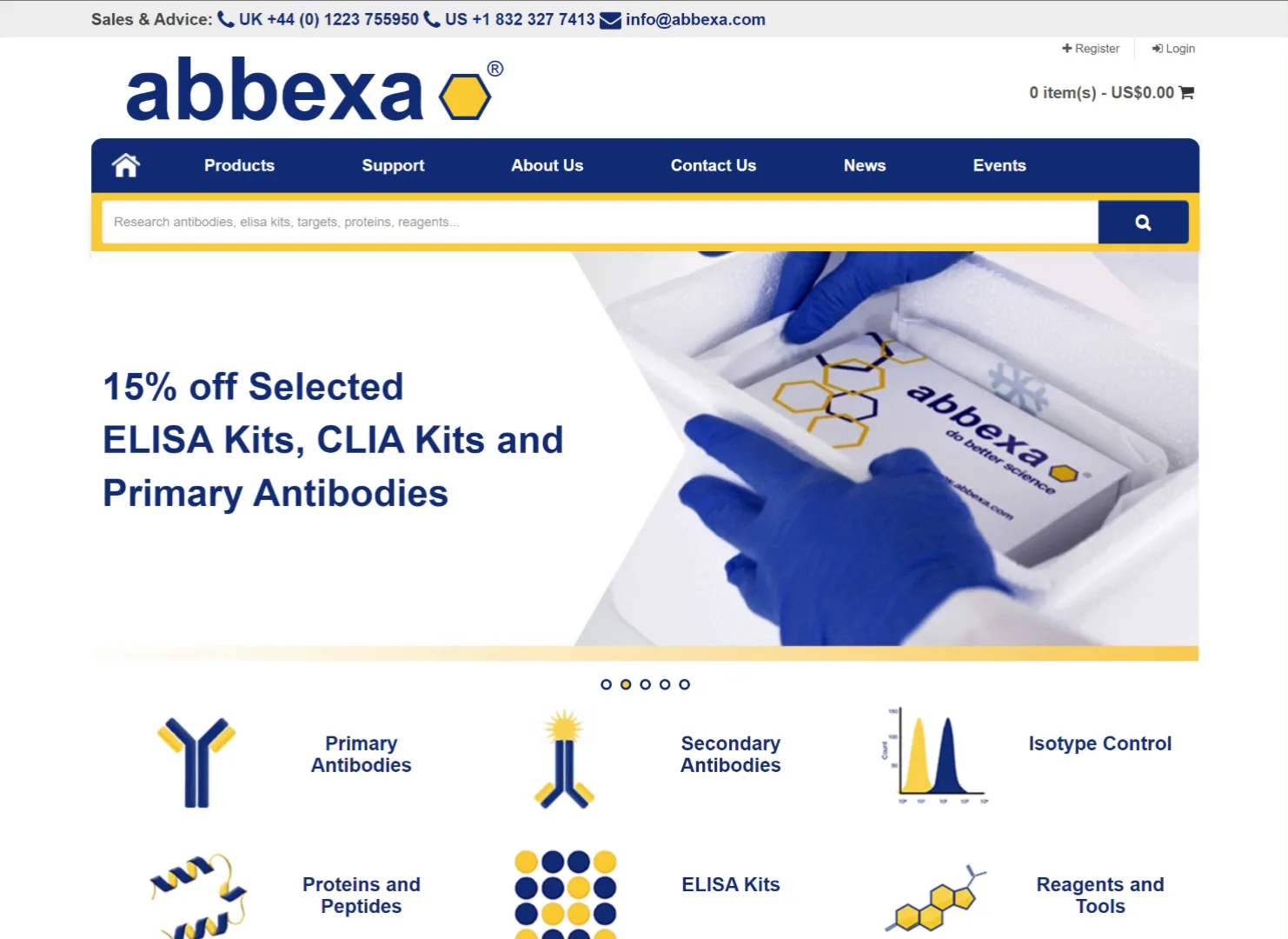
Stakeholders reported that new visitors struggled to understand what Abbexa offered, while specific product searches could return hundreds or thousands of results. Some customers resorted to contacting the team directly instead of completing their journey online.
My approach
I led the design work from discovery through interface design and design-system foundations.
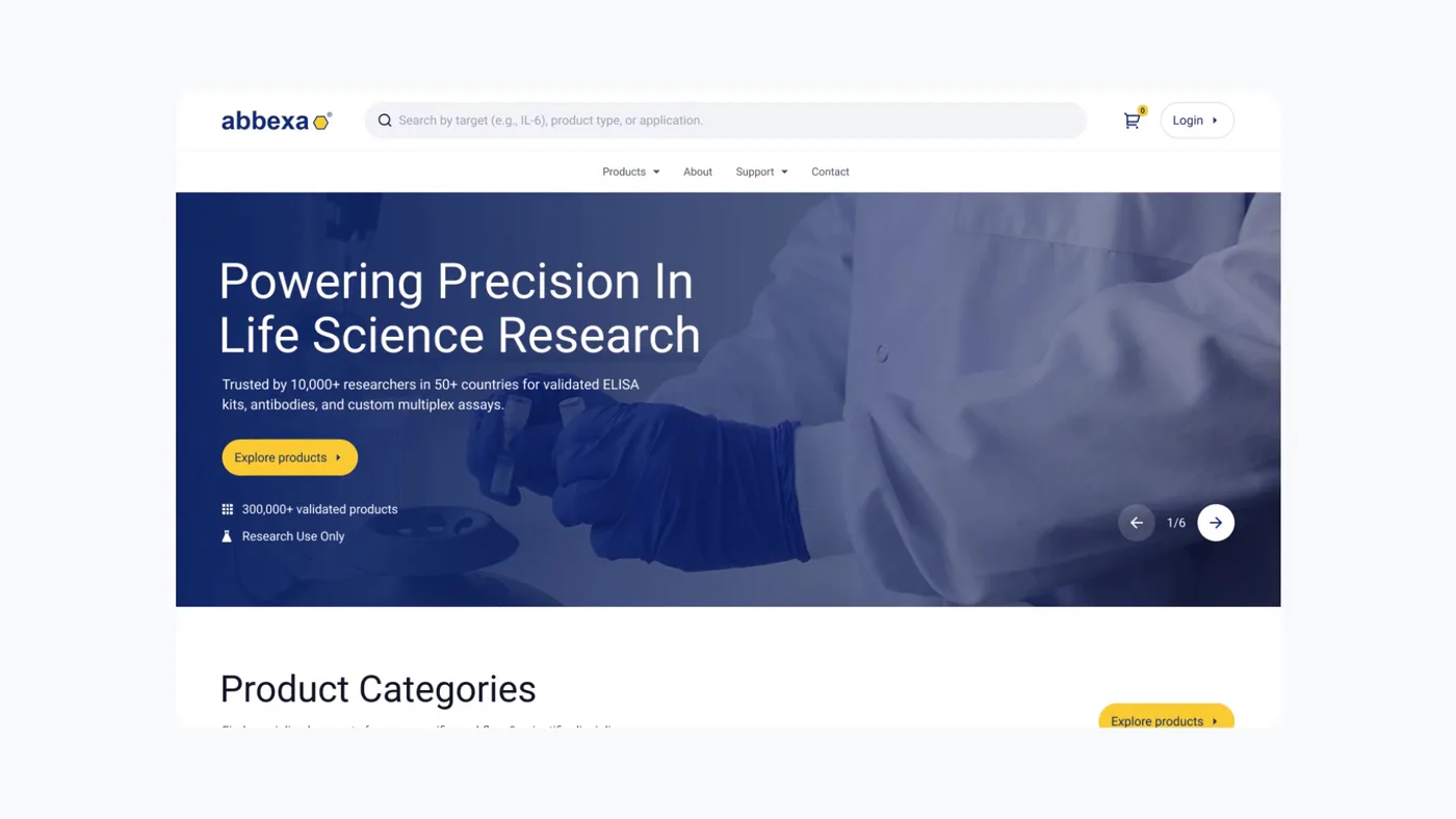
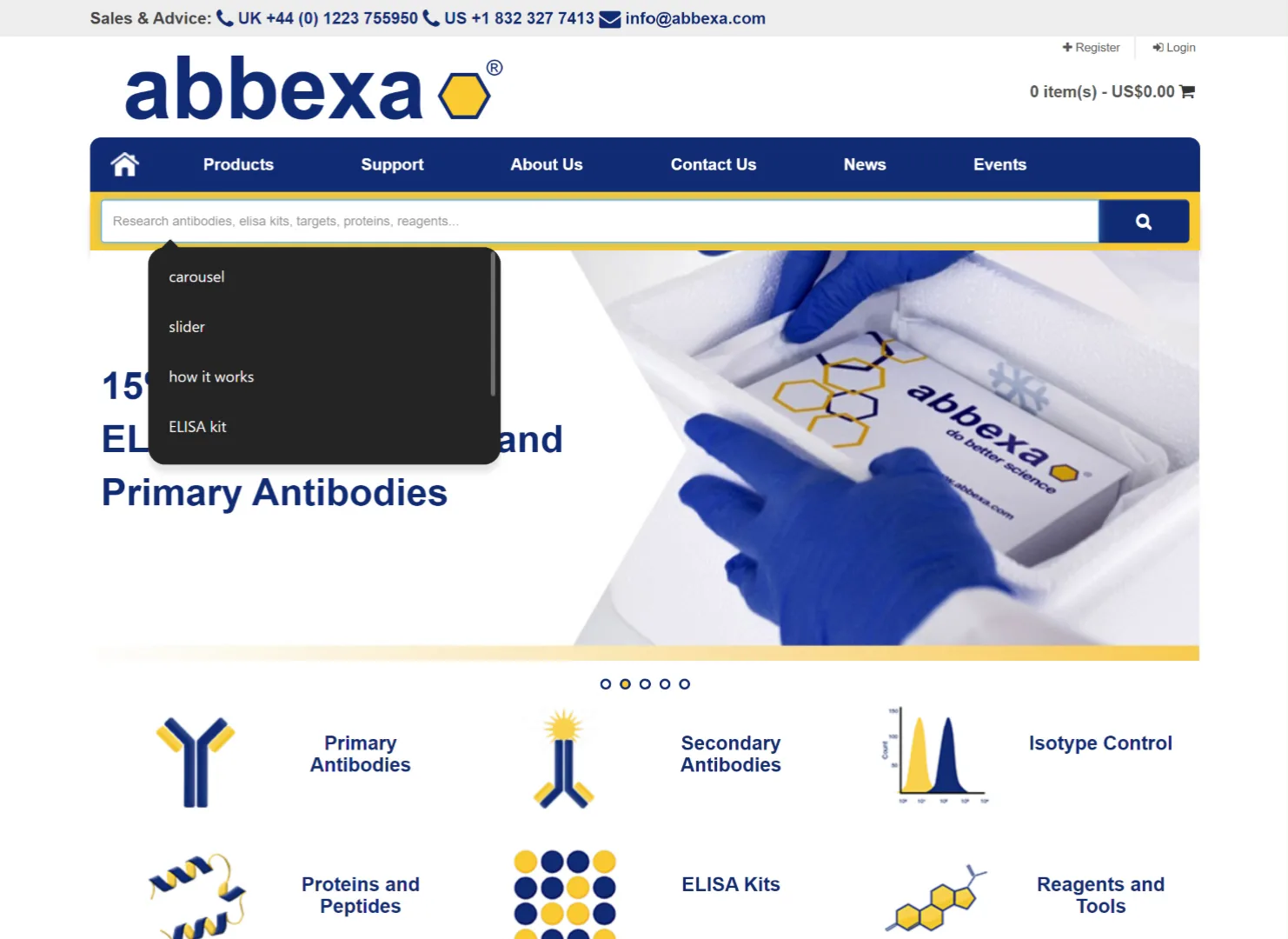
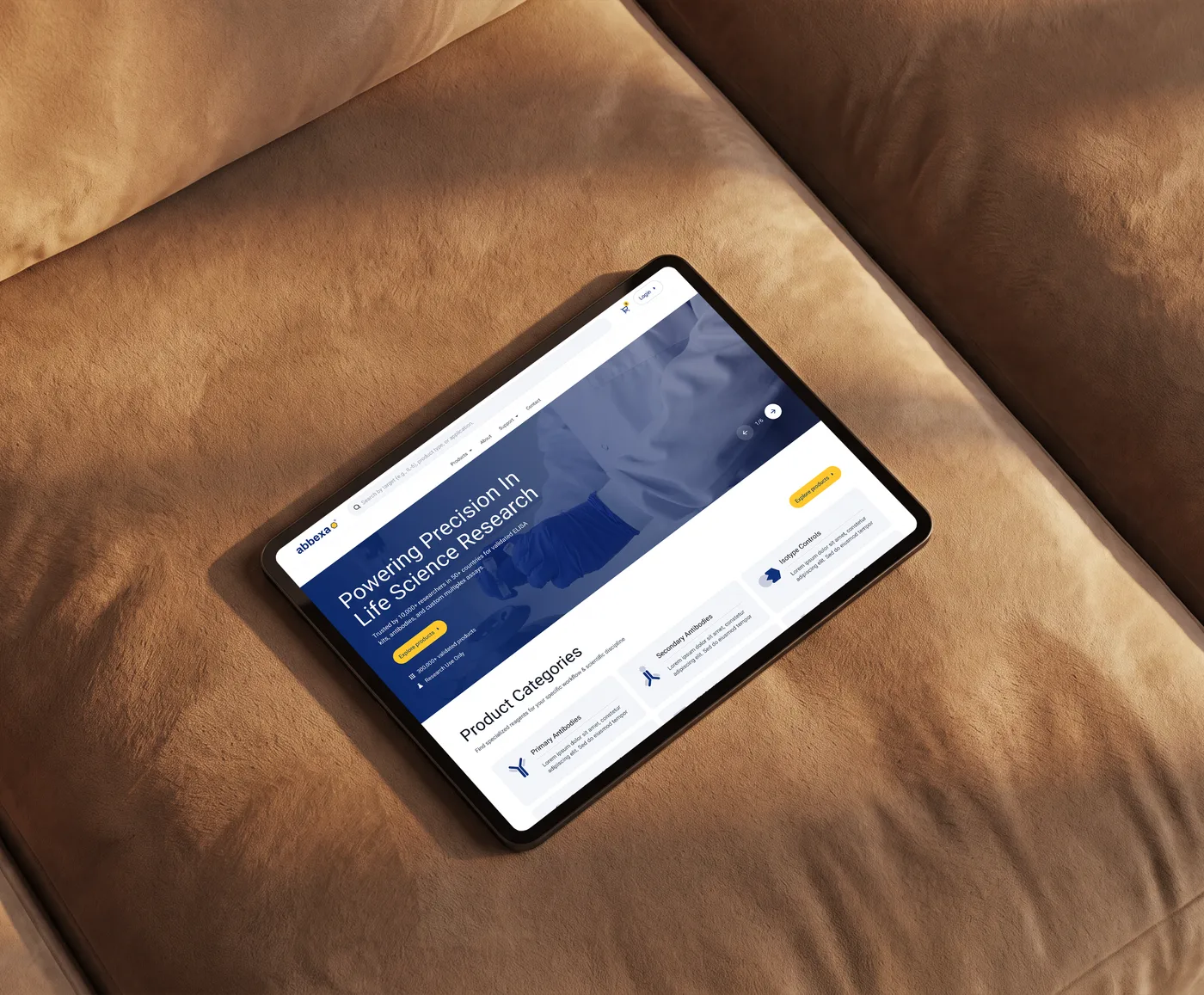
Designed a clearer introduction to Abbexa, combining positioning, credibility, and product discovery.
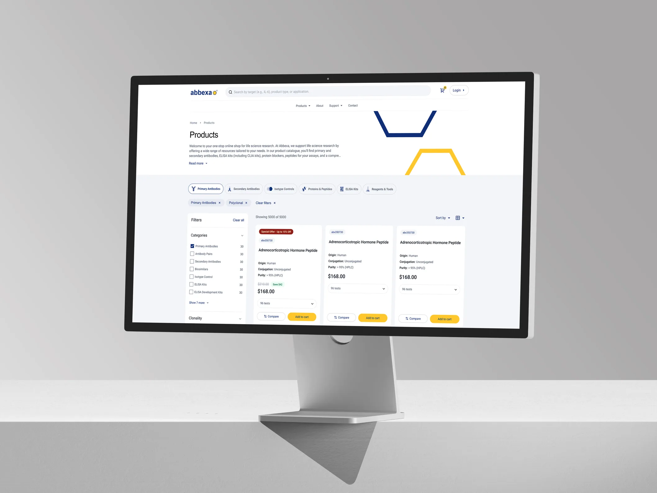
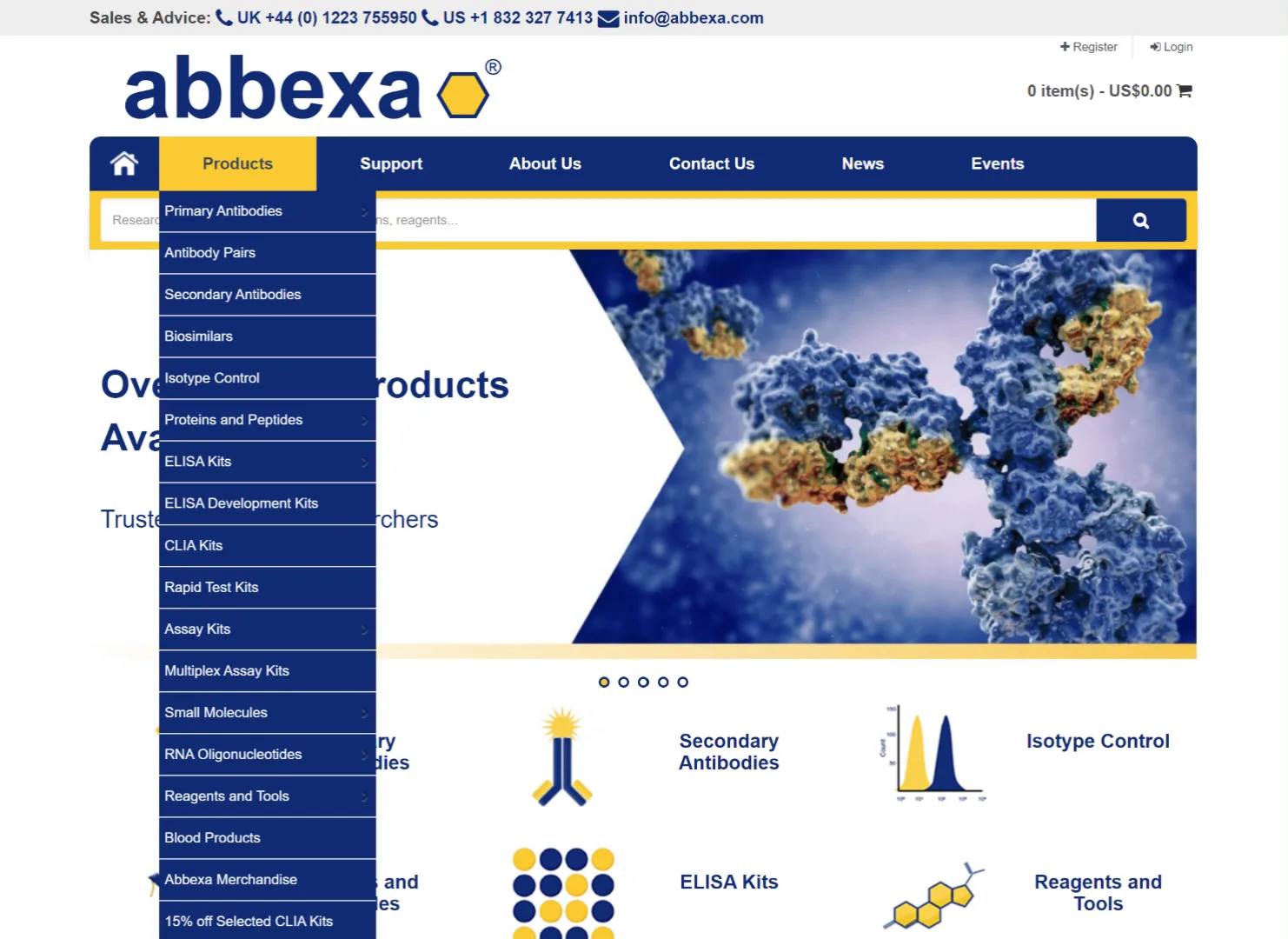
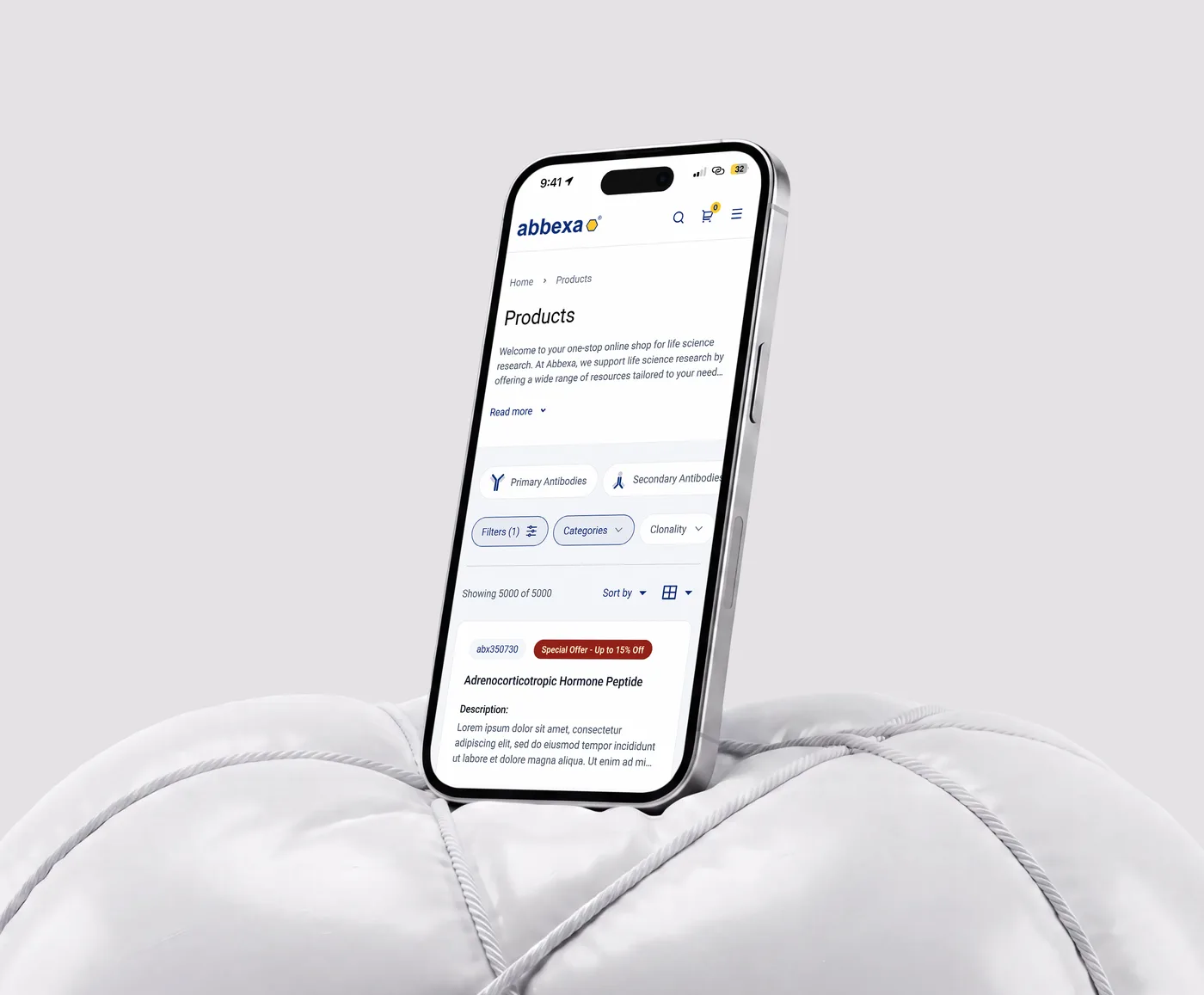
A more guided search experience and category-first navigation designed to make a large catalogue easier to explore.
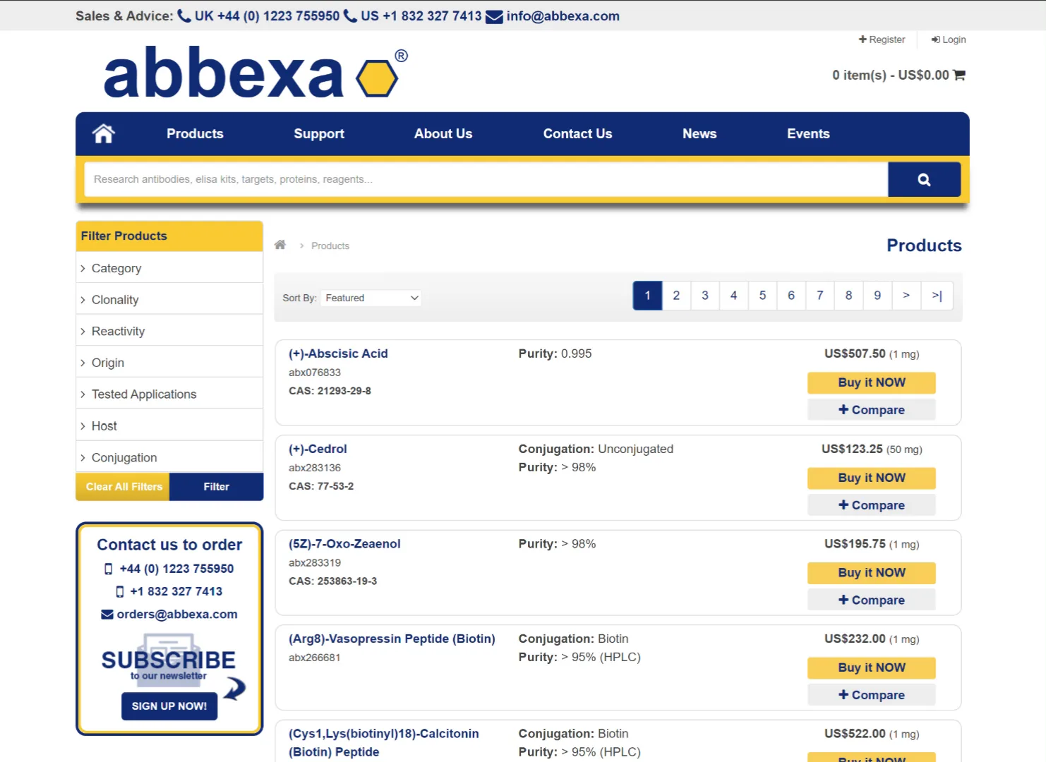
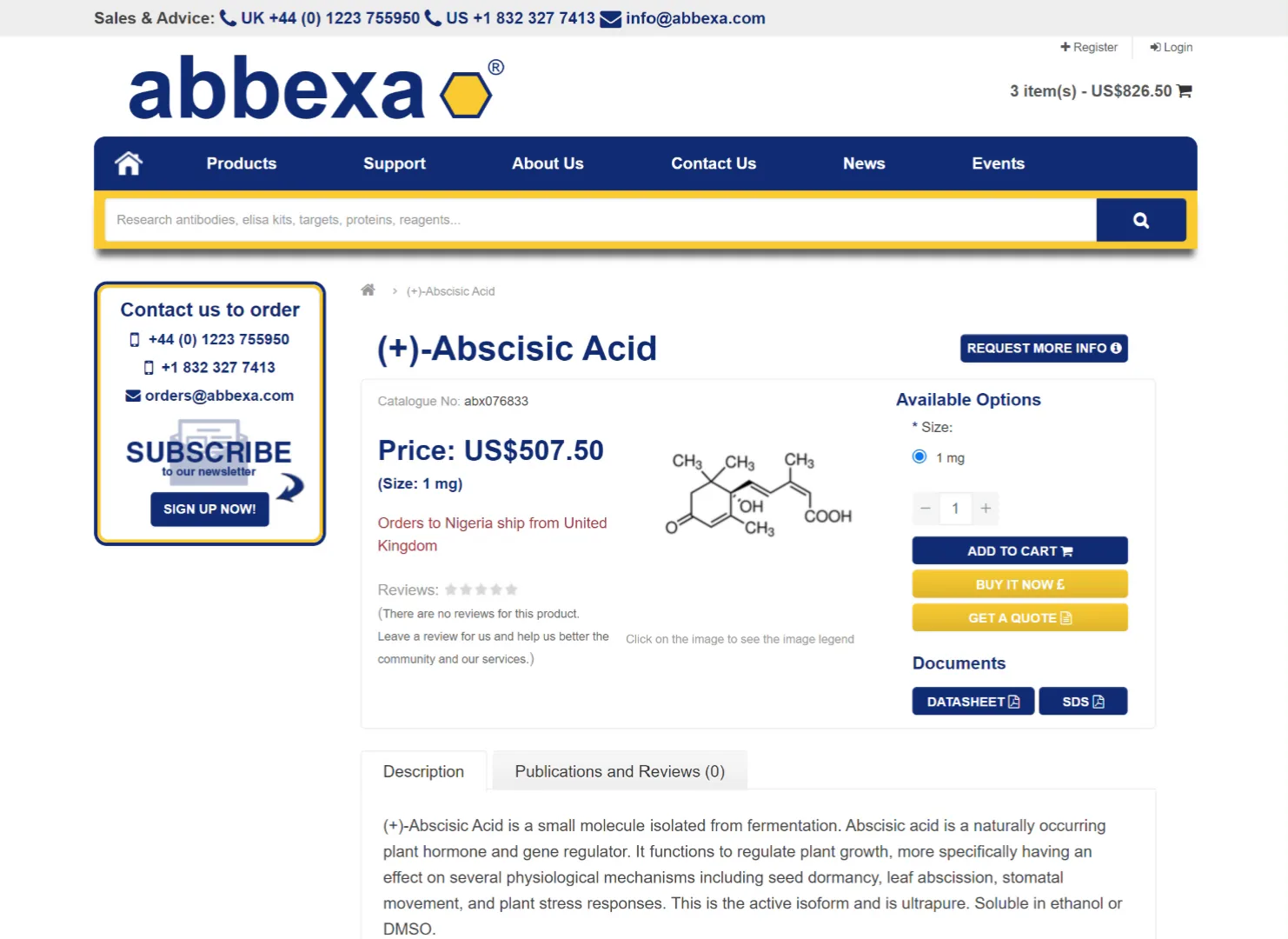
Explorations of clearer product hierarchy, visible categories, and more manageable refinement controls.
Outcome
A redesigned and approved set of core website experiences, including the core homepage and search experience, supporting page designs, product-discovery explorations, and foundational design-system work.
Yolura

An onboarding experience that turns four business details into a tailored, editable booking storefront, helping wellness businesses move from signup to a publishable page without building everything from scratch.
Project details